I think the one thing that surprised me (but not really) about Game Design is how they placed most of the buttons for ads, more apps, store or anything related to monetization in comfort-to-reach area. Now that they mentioned it, I realize how literally most, if not all, mobile games have the same monetization element placement and that’s actually really smart.
Through this article, I realized how much the game designers really have to maximize the game experience considering such a small screen through pop-ups and sliders. I think this is also the reason why most of the games I play are to be played landscape because there’s more screen to utilize. There’s a lot of different components in a game from instructions to prizes to avatars and more and game designers really have to think of ways to include all of these overwhelming information but still avoiding cognitive overload.
The article suggested that there should be animations from end to start in both sliders and pop-ups to keep a positive game user experience. Animations also immediately tell users that they clicked something to trigger a pop-up or a slider; it’s like a form of feedback. I also realized there’s some psychology behind avoiding X and replacing it instead with more positive and fulfilling actions such as done.
Visual Thinking Analysis
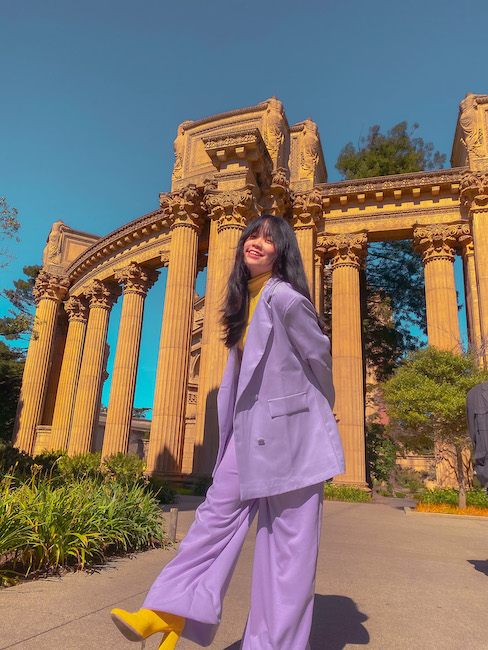
Part 1: My ImageFigure 1: Rheiana Cuevas, 2021
This image was taken the morning after my 18th birthday aka 18th birthday 2.0. In the Philippines, celebrating a young woman’s 18th birthday is a big deal, similar to Sweet 16 here in America and Quinceañera. It is the passage from being a girl to being a woman. Initially, I was supposed to have my grand 18th birthday party in the Philippines but COVID happened so it got cancelled. To make up for it, my family and I decided to go to San Francisco to celebrate my 18th birthday doing what I love the most: fashion and photoshoots.
I began to love fashion and styling myself in 2018 primarily because of Kpop, Pinterest and my growing love for pop culture. When I was barely starting, I usually followed popular fashion trends since I haven’t found my style yet. I remember wearing crop tops and skinny jeans because those were trendy. Then, I slowly started experimenting looks by looking for fashion inspiration on Pinterest and Kpop performances (they really have the best outfits). Though I didn’t really have my own style back then, I never really like wearing dresses and skirts and I preferably like pants. One day, I discovered my love for wide leg pants, pastel colors and yellow. Slowly, I began to build my own style and that style quite navigated to formal clothes but chic and trendy. Hence, I bought this matching purple blazer and wide leg pant suit. And of course, it’s not me if there’s no yellow sooo I added a pair of yellow high heeled sock boots and a yellow turtleneck. Alas, it’s MY STYLE. I remember being so empowered and comfortable with my own skin when I first wore it. Up to this day, it’s still my favorite outfit and people always compliment me every time I wear it.
P.S. When I was taking this picture, little did I know, there were thieves where we parked the car and they stole my whole backpack which had my iPad and other valuable stuff >-<. Also, the police came an hour after and I cried in front of them lmao.
This image relates to the topic of my collection because it’s one of the main highlights of my fashion career and life. It will eventually show the evolution of my fashion style, quite the peak of my fashion career.
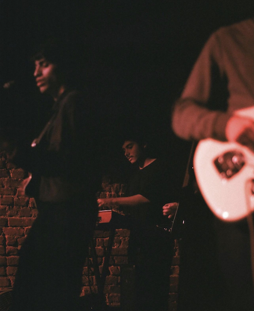
Part 2: My Partner's ImageFigure 2: Ricardo
The image looks like a cinematic shot where guy in the middle (I think?), the one in focus, is with his band and he’s playing a piano or some sort of an instrument. There’s a guy in the left that’s out of focus and seems to be singing and playing his guitar and another person on the right with mainly the guitar showing.
Some of the interesting aspects of this image are the use of rule of thirds, dark lighting and the blurring of the background. The image used rule of thirds by placing the main subject in the middle to be focused on. Also, most of the composition is placed on the bottom half which creates dynamic and depth. Not only that, though it was taken in a relatively dark place, the use of red light created a moody and deep ambiance which adds to the depth of the image. It also acts to balance the darkness. Technically, the main subject is in the background; however, by blurring the foreground such as the guy in the left and right, we are drawn to look at the background with the guy in the middle because it’s in focus.
I think the most obvious is the red lighting and the dark ambiance while the most mysterious part is the composition of the main subject.
The article made me think how powerful and meaningful images can be and that they always tell a story. It really is true that “A picture is worth a thousand words”. By looking closely, noticing even the tiniest details and considering the context/setting/background of when the image was taken, we all can infer different interpretations. Though images are static, the story it tells is interactive.
One website I found that uses image and interaction in amusing and novel ways to inspire Visual Thinking is Unseen Studio. I’m in literal awe with the website like jaw dropped. According to their website, they are a brand, digital and motion studio. They showcase their projects by immersing the users into like a huge hallway that is filled with images related to the project. This hallway changes color as they move on to the next project. They incorporated so many interactive elements that even the photos are interactive. My favorite part of their website is the “WORLD” section where users can explore all their other interactive images around the world. They took the article’s number 7 tip “Expand Knowledge of the World” a little too literal. I think their aim for this section is for users to expand on their knowledge and fully explore the different interactive elements they offer and what they mean. This website is honestly out of this world.
From now on, I will also always try to include accessibility when creating modals especially keyboard accessibility.
Reading this article made me realize that it’s mainly called modals; I’ve been calling these things popup boxes. This article really helped me a lot identifying when it’s appropriate to use a modal, what should be included in it and how can I effectively show it. The “anatomy of a modal window” that they provided was really helpful as it shows how to effectively create and format a model to maximize positive user experience. Also, I didn’t know that it’s important to give users different options to close/cancel a modal like clicking outside the window or the escape key. I will definitely include this important aspect from now on.
Another aspect that I learned from this article is how modals should be triggered by the users. There should be some action that the user did to initiate the modal. I realized that I hate when I go to a website and then a modal would just popup even if I didn’t click anything; I end up not reading the text and just clicking whatever to close the modal (I panic because I always think it’s a virus).
From now on, I will also always try to include accessibility when creating modals especially keyboard accessibility.
I learned a lot about the best design practices when designing forms and this will ultimately help me when designing my MadLibs project.
I think some of the most important takeaways from this article are positioning the label above the input field (or to the left if it has a bigger viewport), providing placeholder text right below the field, adjusting the size of the fields accordingly and chunking huge forms to multiple steps to reduce cognitive load. The article also emphasized the importance of one column layout as it doesn’t ruin the flow.
Recently, FAFSA redesigned their form. I personally disliked the previous design since it was painstakingly long and slow and just annoying in general. In the redesigned version, FAFSA opted for multiple steps providing a progress bar on the top that indicates how far along the user is and within each step, there’s only 3-5 questions provided. In this way, I had a better user experience filling out forms.