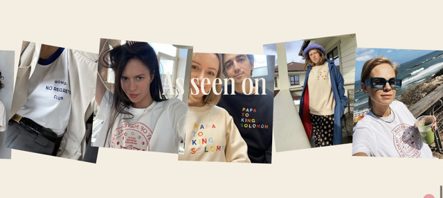
The Momset website has a scrapbook aesthetic as illustrated by the typography, colors and overall layout. The background color is light beige but the font colors are bold and bright like orange and green to make it pop. As for how they displayed the pictures, when users scroll up or down, the picture carousel instead scrolls horizontally which creates a dynamic interaction design. However, it can also disrupt user experience since they may expect to go up and down but instead it's going left and right. Because the pictures are positioned like a scrapbook, it feels genuine and natural which I'm aiming to do for my website. Momset Heroes Website
